Physical
The physical journey considers a variety of functional design attributes relating to the differences of the human body and individual experiences. We believe everyone should be able to navigate through a space with ease, comfort and confidence – regardless of their strength, stature or dexterity.
Level access and movable floor to provide accessibility for all
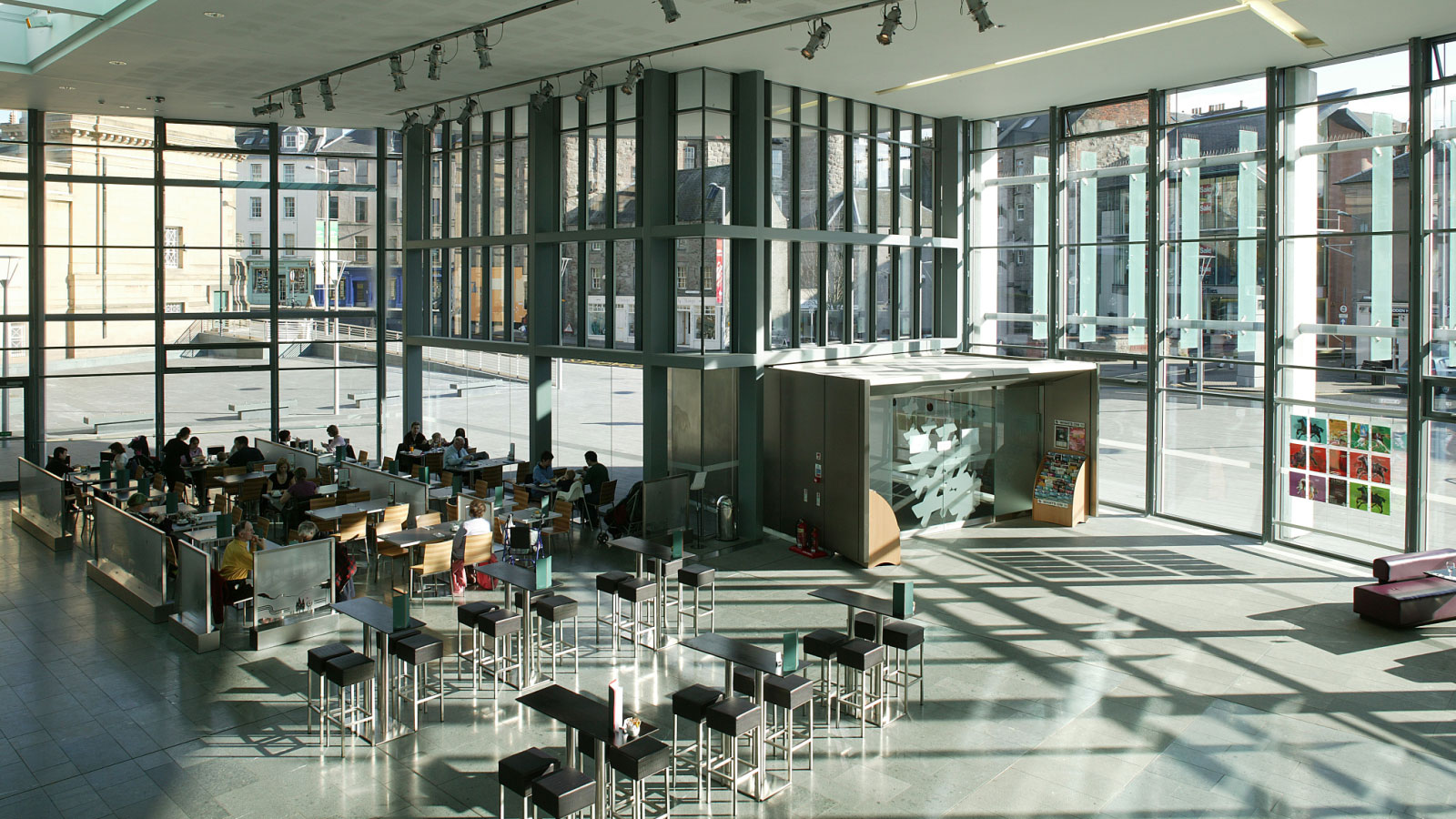
At Perth Concert Hall we designed the building with a public foyer/café/bar that’s level with the new public square outside. This ‘true’ ground level is carried through the auditorium to the stalls where the floor is level with the foyer and street. The concert platform is also level with the street, and the hall is equipped with a vast movable floor that lowers to accommodate raked seating, or can be raised to provide a full flat floor that is level with the street outside.
This solution was important not only to deliver outstanding flexibility in the use and configuration of the auditorium, and strong physical and visual connections between the external public square and the open glazed foyer, referred to in the press as ‘Perth’s Living Room’ – but also to promote a strong culture of inclusivity and public access to make this new cultural destination accessible socially as well as physically.
Contact: Bruce Kennedy
Project: More information
A striking orange ramp suitable for all mobility devices
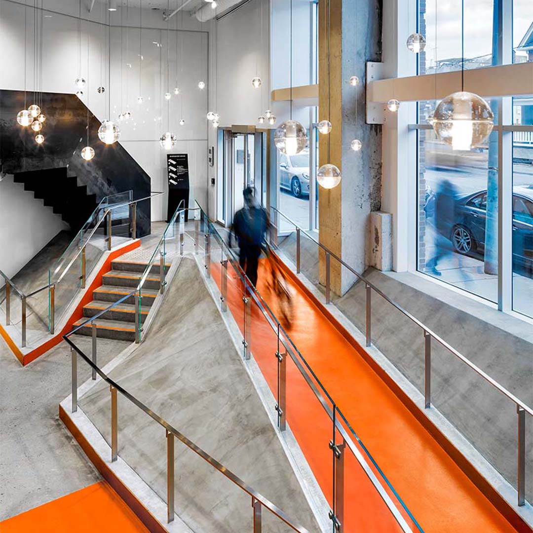
Recognising the value of a building with a fully inclusive entrance and a bold identity, the owners of 100 Broadway Avenue improved access to lower level leasable space with vibrant, high-contrast pathways that provides visual clarity alongside a bold, orange feature ramp designed to accommodate mobility devices of various widths. Additionally, colourful, custom-designed wayfinding elements are carried throughout the building’s hallways and shared areas to provide clear navigation and branding.
Contact: Richard Witt
Project: More information
Sound-sensitive design for railway stations
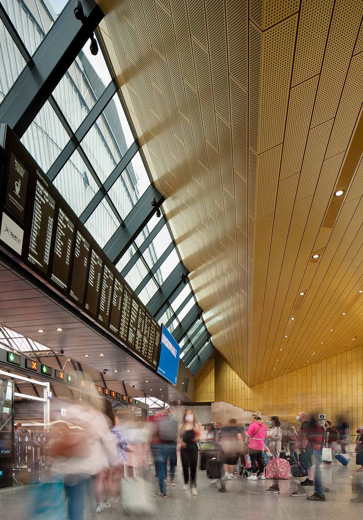
For Glasgow Queen Street Station, we needed to create an acoustic character that ensured public announcements could be heard clearly above the hubbub of station life.
Railway station concourses are large spaces that need to be durable and easy to clean and so inevitably incorporate many hard, acoustically reflective, surfaces. To address this issue, we introduced acoustic absorbent materials in ways that did not detract from the clean lines of the new concourse. We perforated the ceiling cladding and backed it with acoustically absorbent insulation, and introduced a small amount of perforated plasterboard to similar effect.
Interestingly, in one of our Access and Inclusion consultations, a blind participant suggested that some sound from the street, drifting in through the station’s open doors, would help orientate them in the concourse and help them navigate confidently towards their exit. So, it is not just about clarity of sound for announcements, but how sound helps us to understand and navigate our built environment.
Contact: Ed Dymock
Project: More information
Vertical and horizontal cores to assist with navigation
Wayfinding was identified by the client as one of the most important criteria in the design of this new hospital. Working in a very integrated way with the design team and the client, we devised a ‘gate’ system similar to that used at an airport. Vertical circulation cores give access to one or more gates identified by number, that in turn give access to departments and key destinations.
The floor plan comprises three main atrium spaces each containing two primary vertical circulation cores. For ease of identification and immediate orientation in the hospital, vertical circulation cores are identified by a letter.
Contact: Marc Jenkins
Project: More information
Flexible furniture and strategies for sensory disabilities
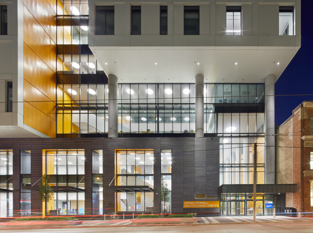
The new building is comprised of an eight-storey educational facility for Ryerson’s health sciences program and an 18-storey student residence tower.
Human Space, our inclusive design consultancy, implemented a strategic approach during a series of drawing reviews through the design development and construction phases to support the creation of physical accessibility to all public spaces, which included classrooms, teaching spaces, lecture halls and faculty areas. The student residences were designed to be fully accessible to people who use mobility devices which included accessible suites. The facility also incorporated flexible furniture and strategies for sensory disabilities, such as colour contrast, light control and strategies for low vision.
Contact: Jesse Klimitz
More information: humanspace.global
Strategically placed lighting to assist with disabilities and impaired hearing
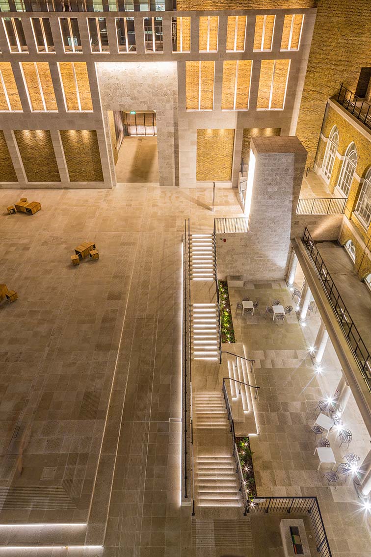
For the refurbishment of University College London’s Wilkins Terrace, our lighting team followed the British Standard Design of an Accessible and Inclusive built environment, which recommends all changes of level (for example steps, ramps and non-flat surfaces) are highlighted to assist the needs of a disabled person.
Lighting was integrated in the steps and ramps as well as the fixed benches clearly marking out the changes of level and the Terrace perimeter. We further ensured that all light fittings were concealed within the architecture details to avoid direct glare for users.
The vertical illumination surrounding the terrace provides high levels of even, reflected light, which is glare-free and which helps with facial modelling and lip reading for persons with impaired hearing. Moreover the lighting accents are meant to improve the orientation through the university campus visually leading users along the route. The lift for disabled users is highlighted with an integrated linear detail along the entire frame, making it easy to spot.
Contact: Andrew Swain-Smith
Project: More information
Engaging wayfinding for young hospital patients
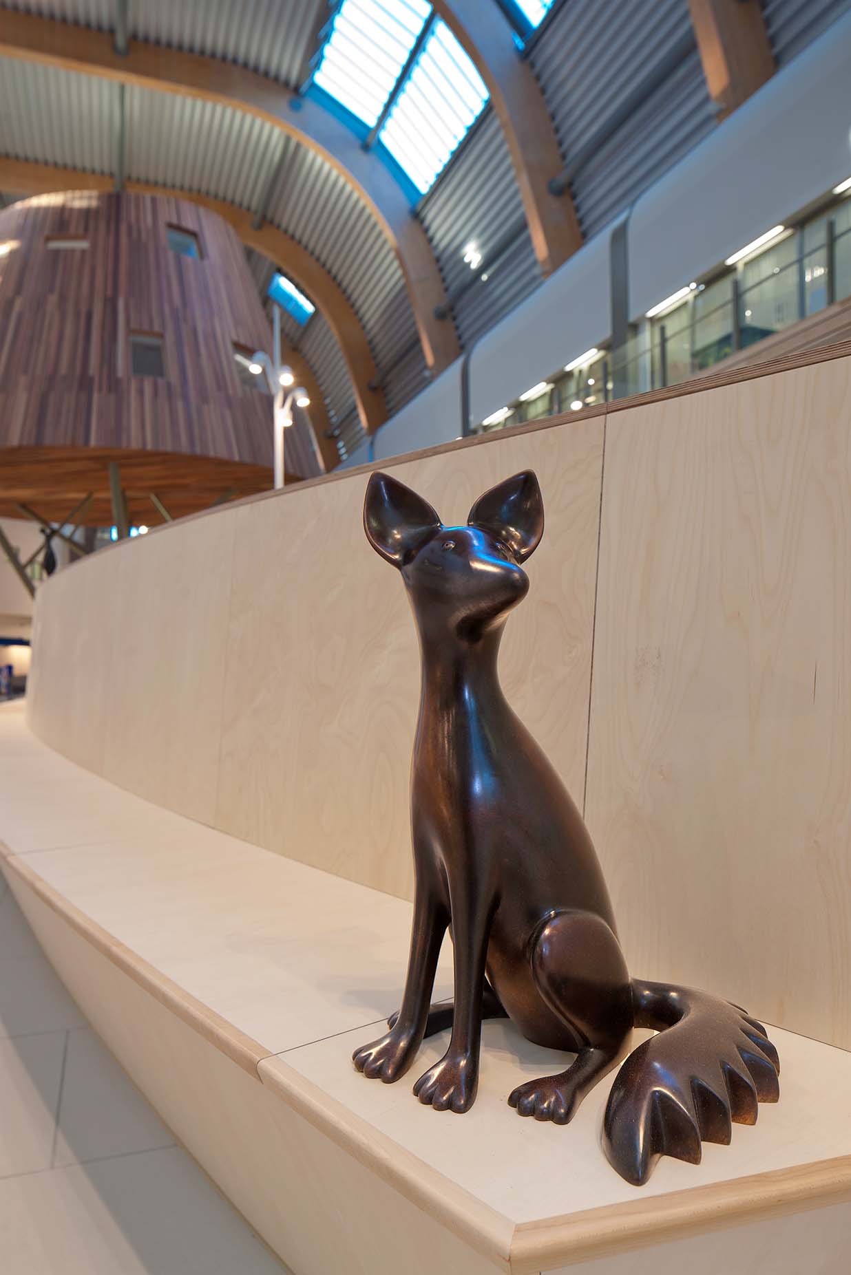
At Alder Hey Children’s Hospital wayfinding is more than just functionality. Our goal was to put young patients at ease in a potentially scary, unfamiliar setting, and empower them to navigate on their own with the help of fantastical ‘beings’, birds and animals acting as wayfinding landmarks and a silent guide.
We wanted to make sure that our designs were ‘child-friendly, but not childlike’, inclusive, universally understandable, and culturally acceptable.
Testing revealed that it was important for the birds and animals to appear both alone and in family groups, to be sensitive to different patient perspectives and situations. We looked at the different types of colour blindness; and adjusted them to meet the guidelines recommended by the Royal National Institute for the Blind.
Contact: Marc Jenkins
Project: More information
Tactile and colour contrasting pathways to aid visually impaired travellers
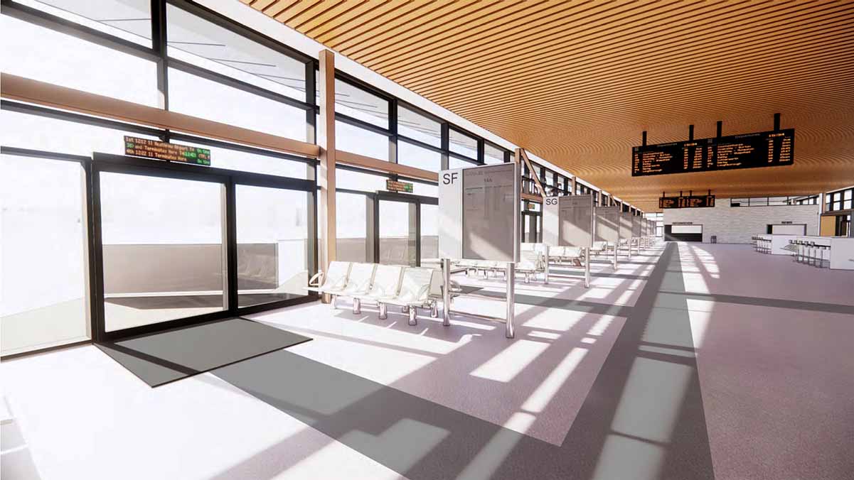
Coloured contrasting and textured tactile pathways were incorporated into the redesign of Leicester St Margaret’s bus station as an aid for people with low vision. The colour contrasting pathway provides a navigational route, whereas the tactile surface signals a change in direction – to assist the user in finding principal amenities throughout the station such as information points, toilets and bus stands.
Contact: Tom Hewitt
Sesame lifts provide barrier-free access to a heritage listed Concert Hall
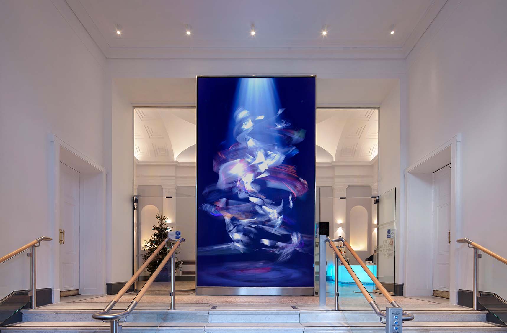
Aberdeen Music Hall is a grand neoclassical listed building with a flight of stairs that runs the full width of the vestibule. Rather than dismantle a section of the stair, to install a conventional platform lift at the side of the room, we designed a solution that integrates a ‘Sesame’ lift in the centre of the stairs.
When not in use, the lift is entirely invisible and covered by the marble stairs. When required, at the push of a button, barriers rise out of the floor and the stairs retract to reveal the lift platform. Once the lift has been used, the platform returns to floor level, the steps emerge and the barriers retract into the floor.
This solution preserves the character and integrity of the listed interior, and provides lift uses with route directly from the front door to the main foyer, rather being pushed off to the side as would be the case with a more conventional lift. The Sesame lift requires a significant lit pit to deal with the retracting barriers, and retracting stair treads, so was technically challenging to install close to load-bearing walls in the listed building, but the end result is worth the effort and cost to provide the client and building users with an exceptional solution to barrier free access that also respects the integrity of the heritage listed concert hall.
Contact: Bruce Kennedy
Project: More information
Open Spaces with inclusive seating areas
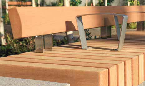
Benches are situated throughout the immediate vicinity of the building and around the pedestrian paths of the lake with a maximum spacing of 50 metres. They are designed with a lateral loading area, and a space for a mobility device to be manoeuvred alongside for transfer to the bench. Armrests and backrests are included to assist with transfer and comfort.
Where seating is grouped together they can be arranged at various heights to suit different people.
Assistance dog facilities
The new International Inclusive Cricket Education Centre at Severn Campus, Univeristy of Worcester will provide a new home for elite level, grass roots and recreational players, of all abilities and disabilities.
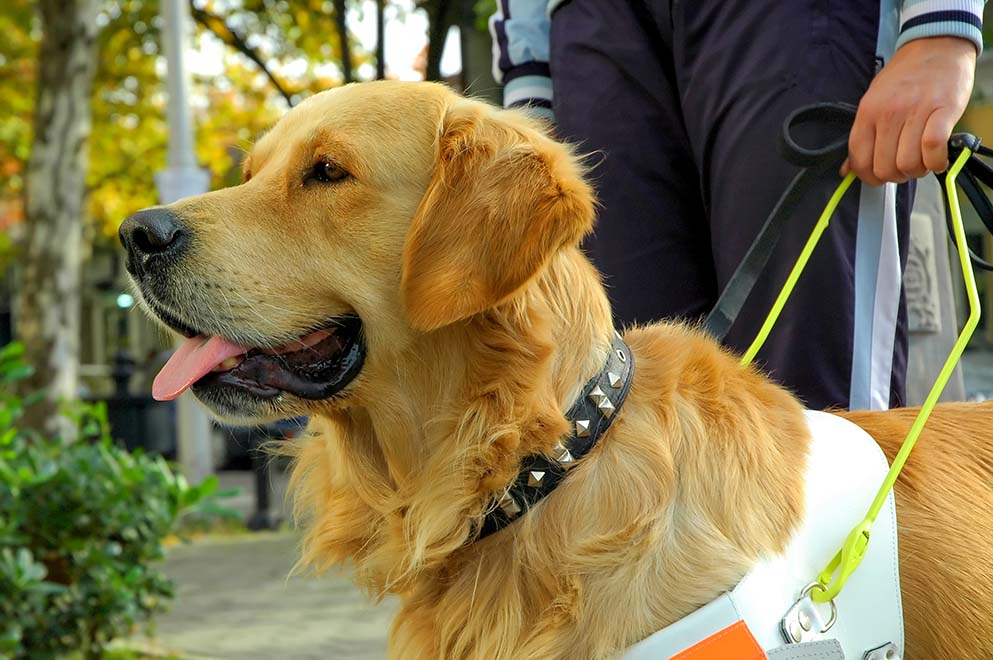
There will also be a spending facility for assistance dogs, which will be a sectioned area, conveniently located, where a guide dog and other assistance dogs can relieve themselves. Service providers have a duty to make reasonable adjustments to ensure that disabled people can access services. This includes amending a ‘no dogs’ policy to allow guide dogs and other assistance dogs. The provision of a dog spending facility may be required as a reasonable adjustment.
The entrance gate to the dog relief area will have a simple to operate and secure catch suitable for people with limited manual dexterity.
The access route to and from the area should be step free and wide enough for a wheelchair user or two ambulant people plus a dog to walk together. There will also be sufficient space for a wheelchair user to turn around and also pull up parallel to the fence adjacent to the gate.
The area will be constructed of 50% hard standing surface, smooth enough to assist leaning, and 50% will be grassed – safe and secure for the dog to be let off the leash!
Contact: Martin Jones
An inclusive welcome at reception
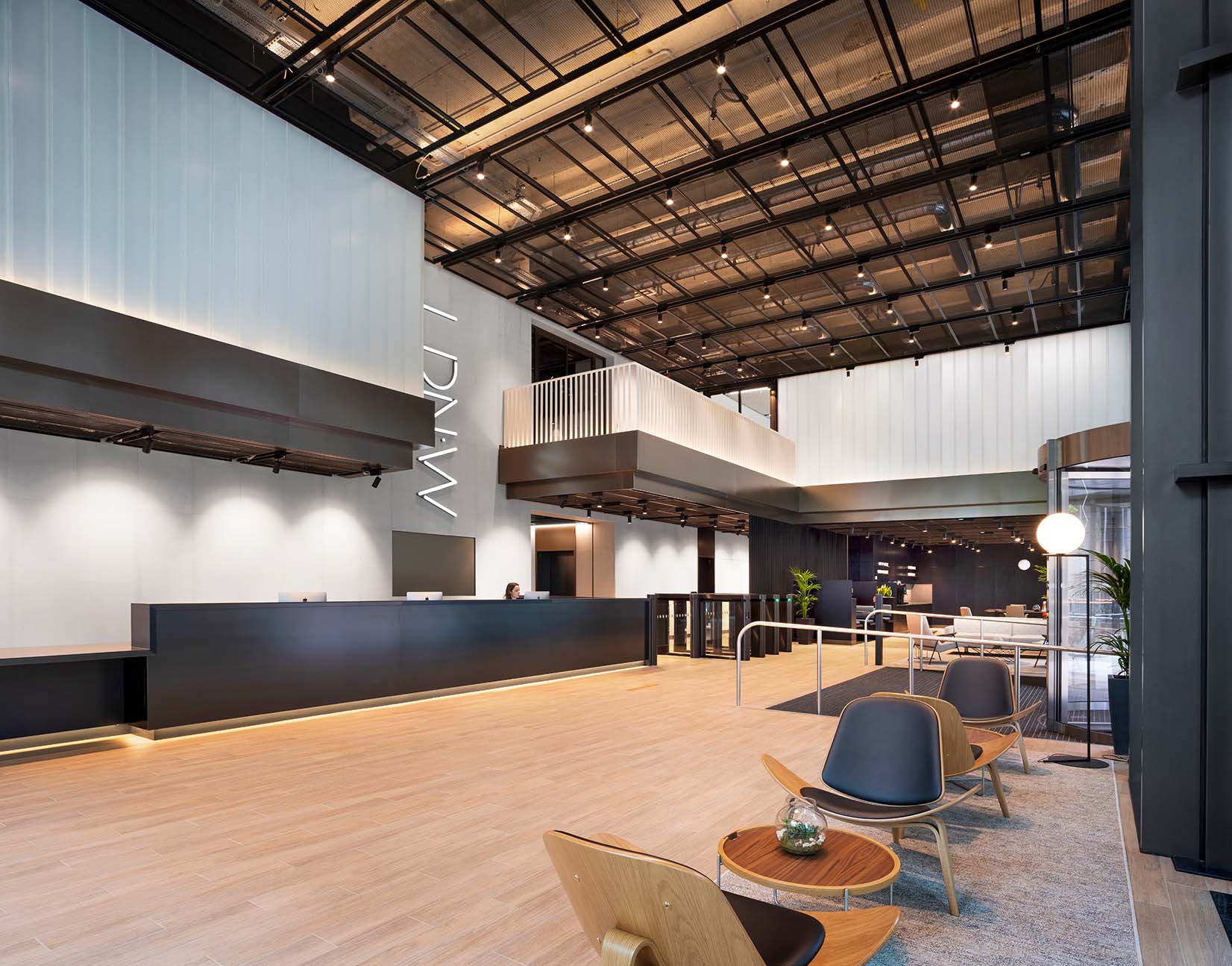
The main reception area to the LDN:W building is located on the ground floor of the building. The inclusive reception area is suitably designed for mobility device users, complete with a lowered counter and an induction loop system at the desk for hearing aid users.
Contact: Mark Simpson
Project: More information
Accessible changing rooms
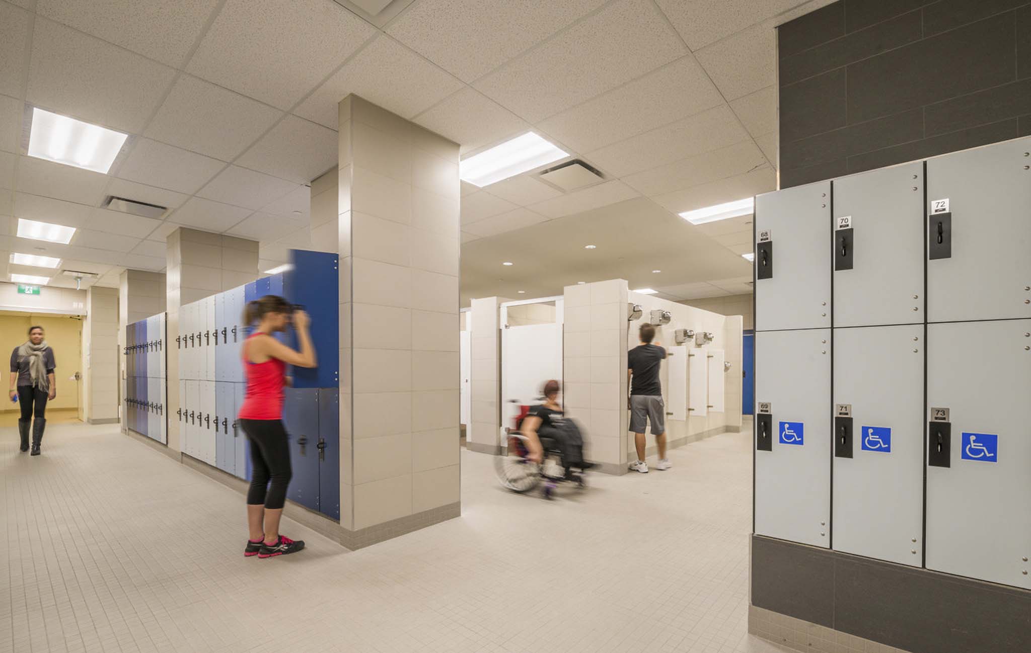
It is important to design changing facilities with accessibility in mind, so that regardless of a person’s accessibility needs, disabilities, or reliance on the assistance of caregivers or specialist equipment, all visitors can use a changing room hygienically and with dignity. This, in turn, enables a wider group of people to engage within their community.
Contact: Matthew Mayes
Project: More information


